TYPOGRAPHY / BOOK DESIGN
One-Pot Cooking
בישול בסיר אחד
A 44-page Hebrew recipe book — fifteen contributed one-pot recipes, three chapters, one grid built to survive them all.

ROLE
Design, typography
and production
BRIEF
Design the book
FORMAT
216 × 140 mm landscape
44 pages, 15 recipes
TYPEFACES
Damka — display
Asimon — text
TOOLS
InDesign, Illustrator
Photoshop
01 / THE PROBLEM
A recipe is five kinds of text
pretending to be one.
The brief needed one grid strong enough to hold recipes of wildly different length — very short, medium, very long.
Each recipe stacks five kinds of text — title, byline, story, list, instructions — all set RTL in Hebrew.
02 / PROCESS
Five rules, so that
fifteen spreads needed
no new decisions.
A
One concept object,
carried the whole way through
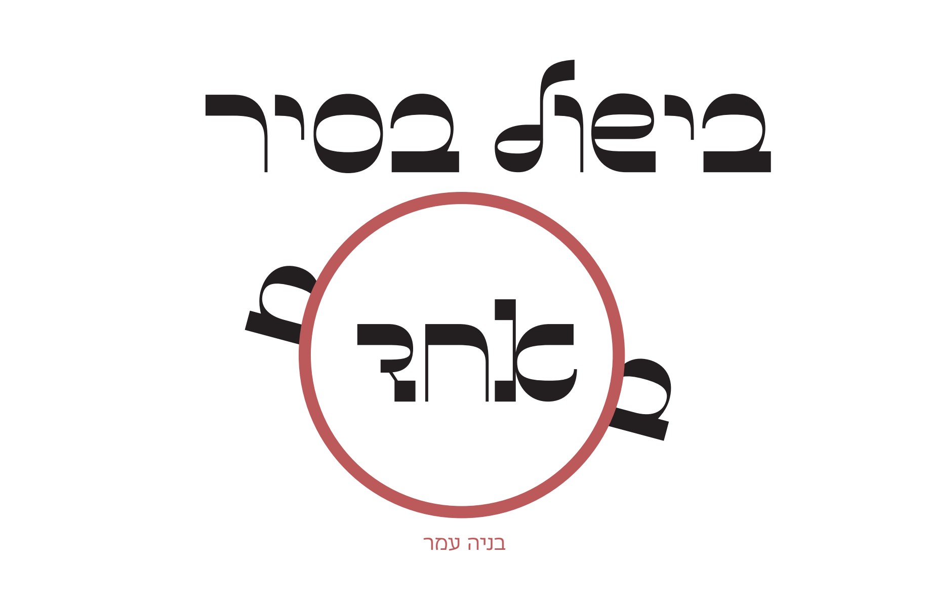
The cover assembles a pot out of type — a ring, two handles, the word אחד ("one") inside it. That ring resurfaces four times inside the book, stripped of its text, until the reader reads it as a pot without being told.
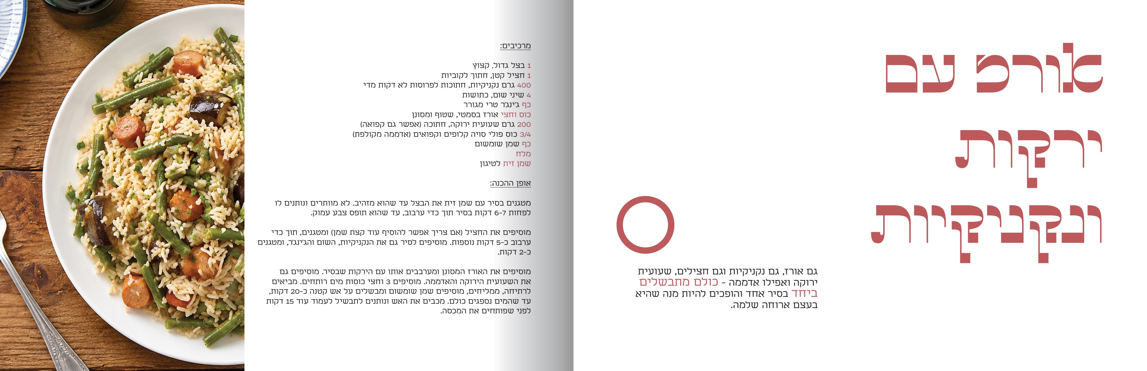
Page 39 — the ring, released from its job.
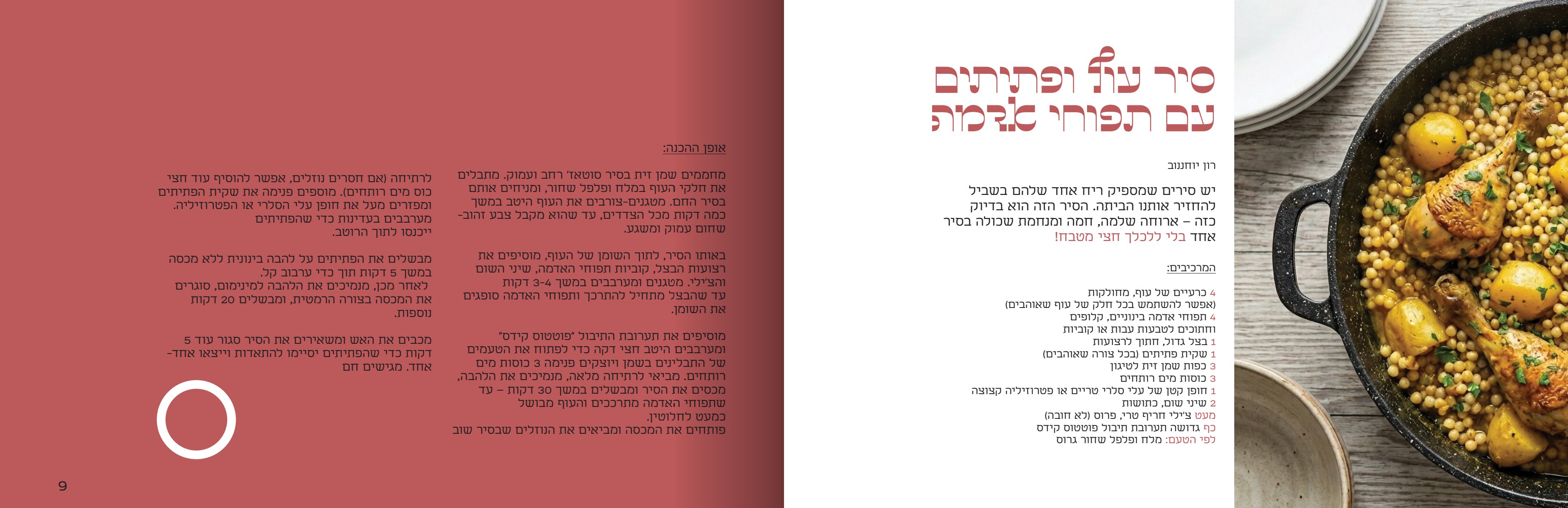
Page 9 — inverted, opposite polarity.
DESIGN EYE
Letting the ring migrate inward — stripped of its text — is what turns a cover gag into a book identity.
B
Two typefaces,
hard-separated by job
Two Hebrew faces, split absolute: Damka takes every display moment, Asimon takes everything you read. Damka never drops below display size; Asimon never scales up to compete.
C
One colour,
doing four different jobs
A single muted brick red, #BC595A, plus black and white — doing four separate jobs:
01
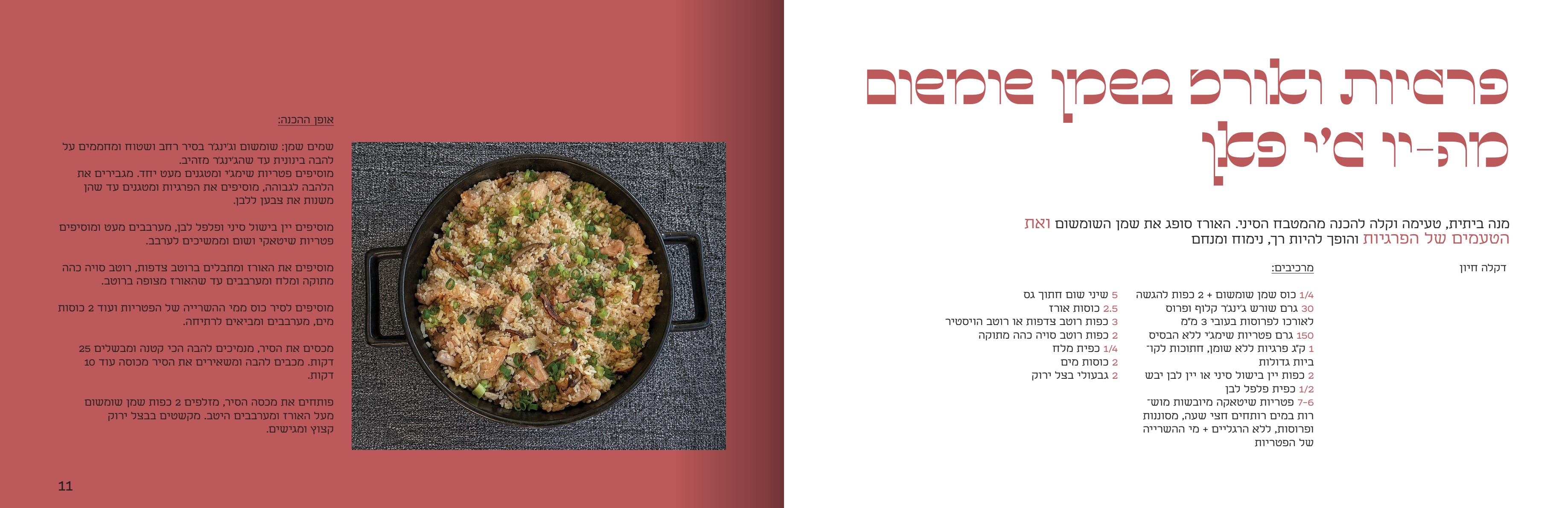
Field — a full-bleed panel holding the title
02
Emphasis — a phrase mid-paragraph switched to red at the same size, giving a pull-quote without a pull-quote
03
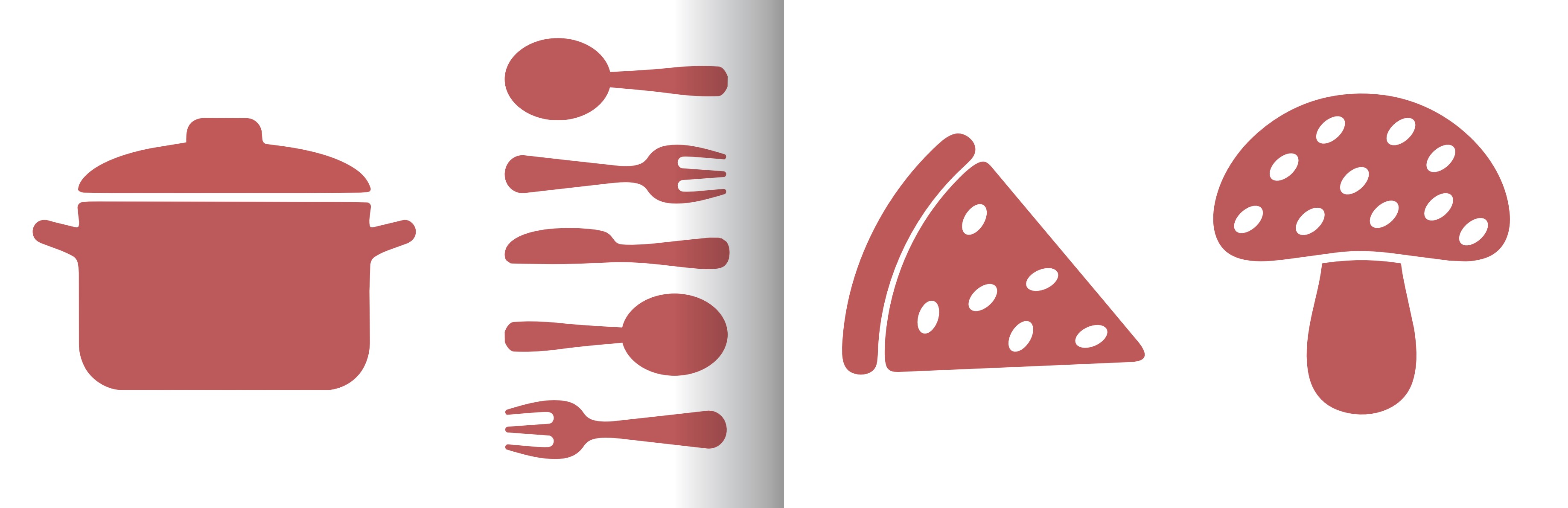
Illustration — the flat vector pot, cutlery, mushroom, egg
04
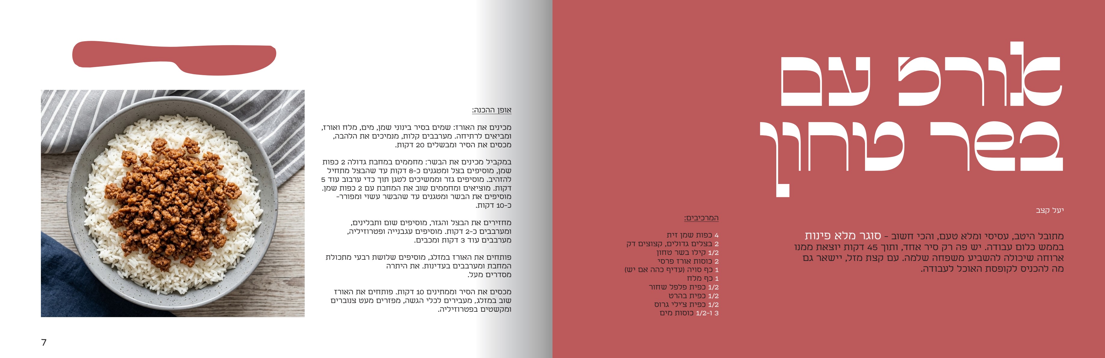
Quantities — every numeral and unit set red inside an otherwise black ingredient line
DESIGN EYE
Because Hebrew runs right-to-left, the red quantities line up at the right edge — hierarchy achieved by ink alone, no bullets or indents needed.
D
The inversion system
Every spread flips a red field against white — red right, then white right, then red with an inset white panel. One field states, one instructs; only the geometry changes.
E
Solving for length by giving up
something different each time
The brief's stress test, answered at both extremes.
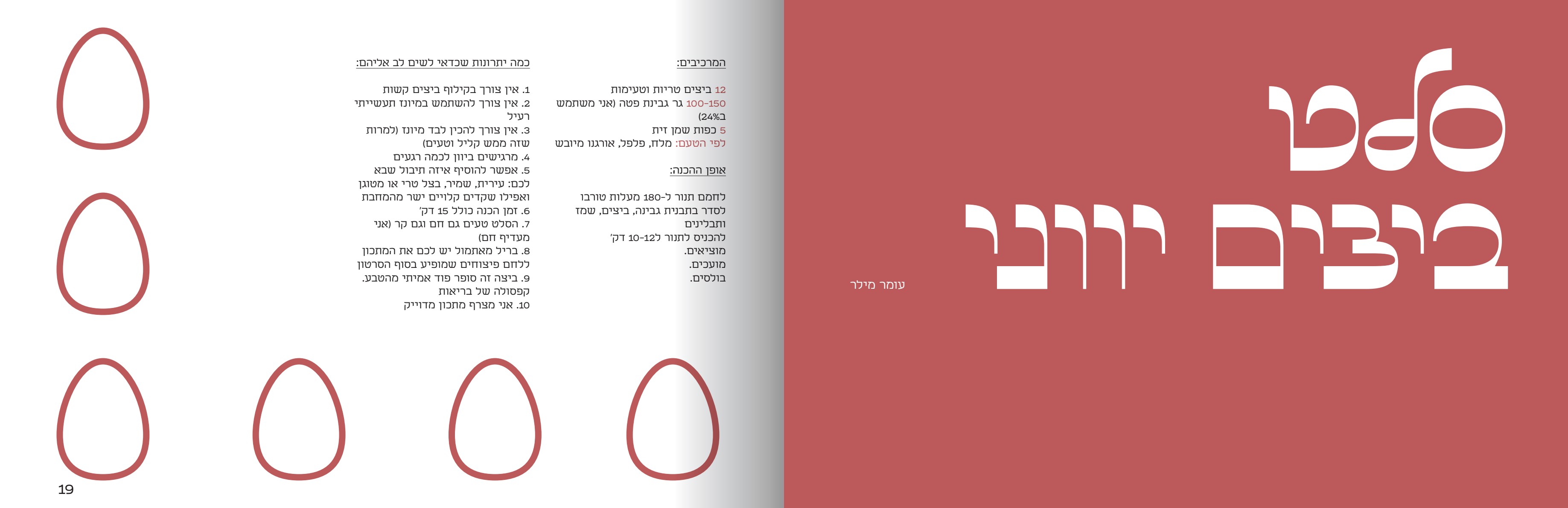
VERY SHORT — GREEK EGG SALAD
Ten ingredient lines, four one-word steps. The empty half takes a scatter of red outline eggs — shortness becomes character, not a problem.
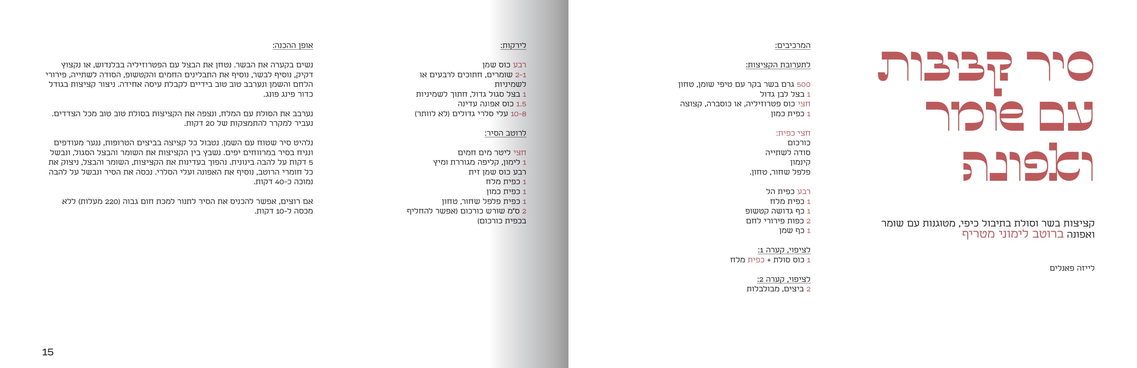
VERY LONG — FENNEL & PEA MEATBALL POT
Four sub-lists, a long method — no photo, no red field, just four columns of black type. Imagery is the release valve.
DESIGN EYE
The all-white, type-only spread is the most mature move here: when content wins, imagery is dropped rather than the text compressed to fit.
03 / OUTCOME
The system holds at four words
and at four columns.
A complete 44-page book — cover, contents, three chapters, fifteen recipes in all.
Every requirement met by a rule, not a one-off — fixed elements cleanly separated from variable ones.
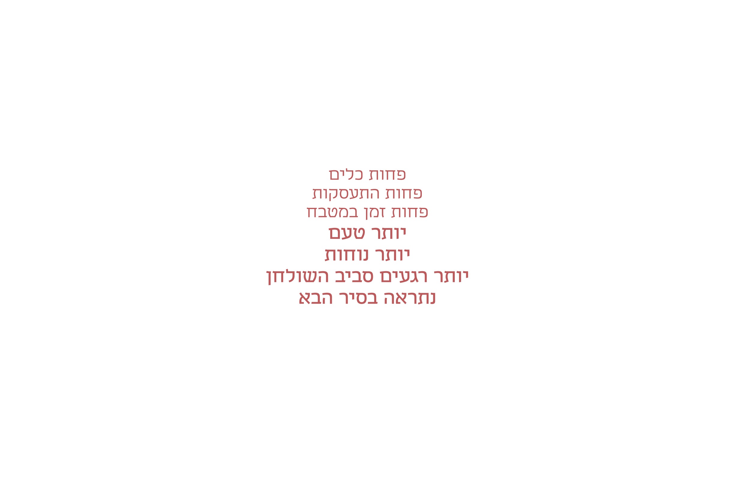
Fewer dishes. Less fuss. Less time in the kitchen.
More flavour. More ease. More moments around the table.
See you in the next pot.
© 2026 Benaya Amar.
← BACK TO INDEX